Link the word “craft” to beer or gin and a certain visual aesthetic may come to mind. An over-embellished, over-indulgent interplay of over-worked type, pattern, whimsy and witticism. In design terms craft has become pejorative. Like baroque art of the mid 18th century, many accuse craft of having more style than substance.
But not every craft beer, whisky or gin displays an abundance of artistry, filigree and detail.
There are some great stand-alone “craft” gins out there that stand apart. Confidently projecting a single-minded story. For them the craft of distilling and making isn’t slavishly replicated with a “crafted” label.
No overused craft design tropes with the beautiful simplicity of The Botanist Gin or mesmerising Mermaid Gin. No cries of house-style on Stranger and Stranger’s Harris Gin.
But things get harder when managing a craft portfolio. It becomes a balancing act, slotting the pieces together to create a uniform whole.
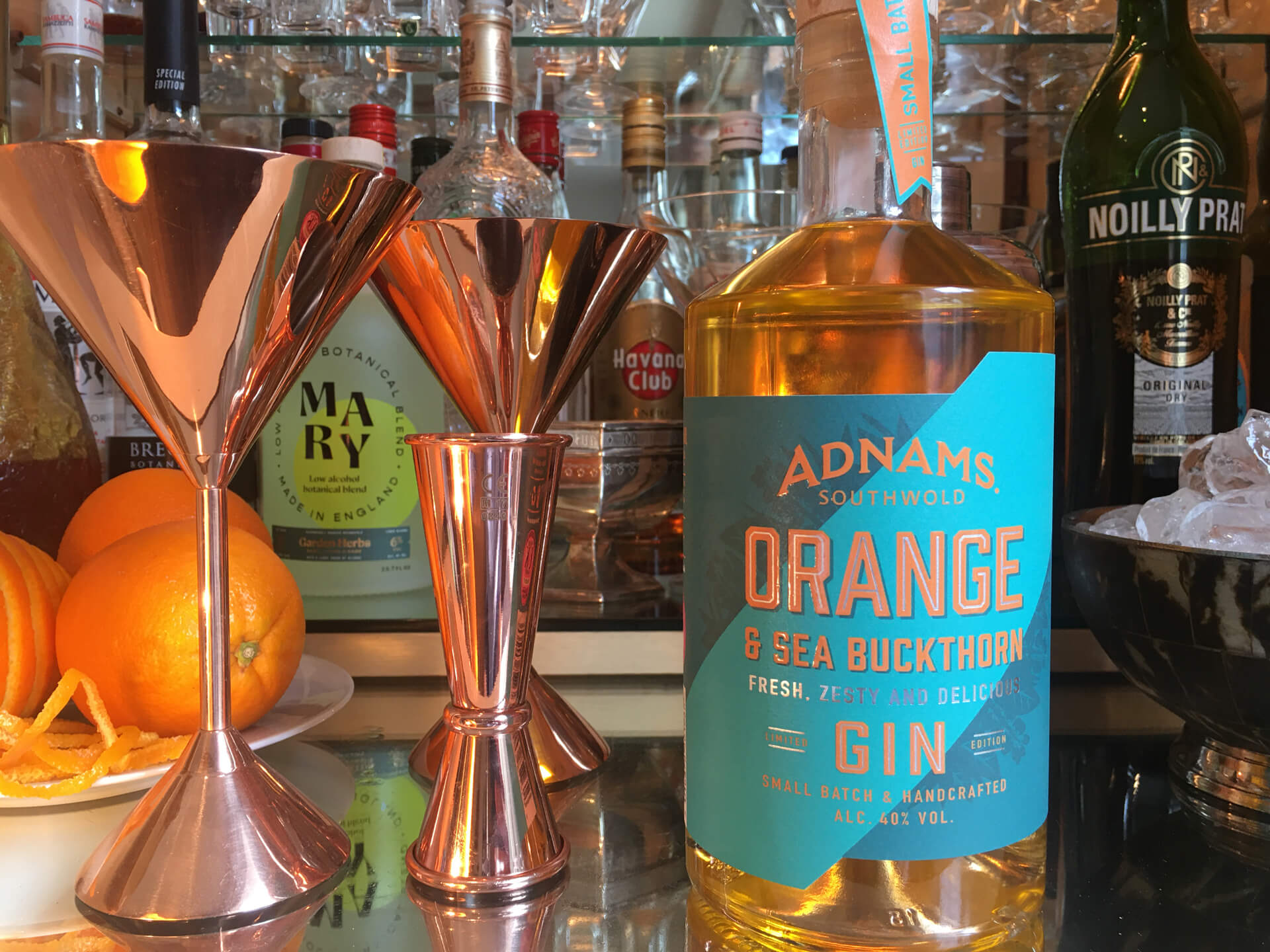
So, I was particularly excited to see how Adnams is evolving its range of gins with a bold contemporary aesthetic. Starting with its limited-edition Orange & Sea Buckthorn Gin. Small batch and handcrafted.
Gone are the sailing boats and flora and in comes a stripped-back, bold, green label with dynamic diagonal cut-through and punchy orange type.
Colour was always an important asset to Adnams. Like many sea-towns light seems brighter and more vivid in Southwold. But now it is used with real force. The label bursts with flavour. Full of heady orangey sweetness and grounded sea-salty depth.
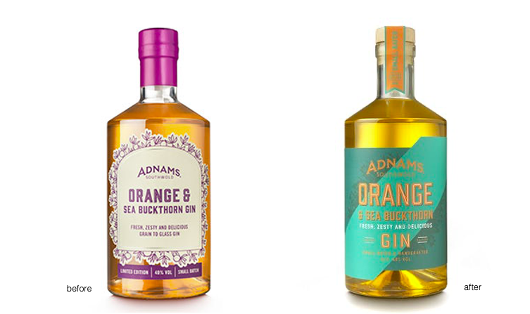
Colour, type and shape. Fullstop. A clear case of less is more.
And like all beautifully crafted things it’s been part of a journey. For over 15 years Lee Cook, of Cook Chick Design has skilfully piloted Adnams as it has grown its portfolio. From beers, to gins and whiskies Lee has fashioned and crafted a flotilla of truly intriguing offers, that comes together as a unified whole. But more importantly he has given the brand a new vigour and confidence in the way that it talks about craft.

My hunch is that more small batch, craft brands will adopt a similar approach and start pulling away from design stereotypes of craft. Perhaps because we’re ready for “craft 2.0”. Perhaps because brands always want to move things on. Perhaps because they risk parody if they don’t.
So, hats off to Cook Chick Design for raising the foresail and making good headway in this sea of craft.
This is an impartial review.
Headline photography taken at Mr Gray’s Drinks Cabinet.
For future reviews write to nick@mrgraybranding.com